![]()
| Local Profile: Kezam |
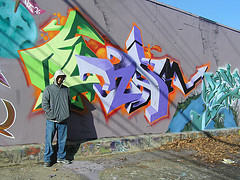 |
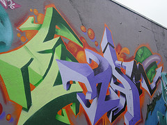
Kezam is a sociology student, who moved from Australia. You can find his work in public places all over the world. He came to New Haven to go to Yale. TownofNewHaven caught up to him to ask him a few questions about his graffiti style and his life history. Here's the interview. |
 |
Okay,
I saw your work on flickr and puregraffiti and really like your style. Obviously it took a lot of certain work on your own to get where you are. What would you say is the major factor in getting to your level? |
|
k.
: Thanks for looking at those sites and appreciating the work. The major
factor in advancing to any level in anything is persistence. You also
need determination. It is not, however, always clear as to exactly what
you are striving for. One of the most prevalent ideas about graffiti
writing is that it is all about "fame". I don't think that
is true or counts for an adequate explanation. Maybe a sense of "mutual
recognition", but the concept of "fame" is inappropriate.
But I think it eventually becomes an inner drive or an inner project.
There is something that is meant to be happening on the wall and in your work as a whole. So I think the driving force behind creation is the articulation of an idea. Once that is done it is time to move on to the next idea. That is why you can detect a certain style in people's work and why you sometimes see major breaks and changes in what they are doing as artists. You also need to have certain basic material conditions met. You also need time. And you definitely need to take risks - that includes legal, physical, aesthetic risks and so on. In hindsight, it is kind of crazy to think about half the shit I have been through because of graffiti ? Then again, there probably aren't too many writers that will tell you anything different! |
|
Did you play with legos when you were a kid, or any other building toy for that matter? And if so, do you still use physical objects to visually help guide you into the shapes that you create two-dimensionally? |
 |
k:
: No. Didn't play with Legos or building type toys. In fact, I Creating shapes and object like appearances, especially the 3d stuff, is more of a mediated process. I will start off doodling, then step back, and then see how those doodles could become something. Then they become a little more, and then a little more, until you can really begin to see where the image could go. Then, after you have a final image, you can tweak it endlessly. Soon enough it becomes something else. I also turn letters upside down, look at them backwards, look at them in reverse, upside-down backwards in reverse and so on? One time I turned what started off as an "M" into a "K" ? Quite bizarre? |
|
What's your preference in terms of paint. Do you go for the beltons or
the montanas? And when you do shading, do you use different shades of the same color, or do you use white and black to give the lighting effects? |
 |
k:
I like the Beltons and the Montanas but find that the Beltons don't |
You
should also be able to make it appear as though you have about 6 or
7 shades at your disposal. It all depends on how you use the mist of
a color. Say you have two shades of paint, you can use the lighter color
as a base coat and then mist over it with the darker shade. If the mist
is light enough, that same shade that you misted with will look like
another color altogether if applied straight onto the wall. If you look
closely in some pieces you can see that it is the same color being used
in some parts, but that it looks different depending on how the can
is being used. |
|
tonh:When doing a serious piece, how many times does
it go on paper, and how many times on to the wall? Even after all the
techniques you employ to get the desired result, does it still look as
magic to you as it does to the average observer? |
K: The pieces never look fully satisfactory to me. Before I take the photo I can usually point to what I would consider 2 or 3 major errors and probably 3 or 4 minor oversights. The funny thing is that I know about the errors but don't fix them. I do this on purpose. That way I want to do another piece as soon as I finish one. You can often see where there is going to be errors as soon as you start putting paint on the wall. But these deliberate errors are functional - They make me say to myself every time I finish a wall "I'll do it right next time". As soon as one has nothing to strive for it is all over ? I also think it is important to not have every thing perfect. There is something about the aesthetic of graffiti that demands some parts not be all that well executed. That view may well come from years of working with crap paint and conditions in which it was pretty much impossible to get everything exactly as you want it. That may also explain why some people have said to me that they see different temporal moments in these works ... If you look at earlier phases and moments of graffiti history you will see this. Not everything is perfect but somehow that is what makes it work. For example, there is a MADSEEN whole car in the book called Subway Art. It goes across the top of page 79. For many years I never noticed this but the shadow in the "D" is logically incorrect. It is clearly not the way it should be. It should go the other way. But at the same time it is one of the best pieces in the book in terms of effectiveness. Error gives a sense of human touch ? It reveals the beauty in a form of creativity not reducible to the impeccable logic of a machine. The point is to keep the pieces human ? |
See More work from Kezam at: http://www.flickr.com/photos/kezam/ |